UTOKIA FARMS BRANDING

The owners of local cannabis farm reached out to me looking for help establishing their identity. Run by a passionate husband and wife team committed to healthy farming practices they wanted to delivering a top shelf product to their consumers, and as lifelong avid gamers, they really wanted a brand that felt like it tied into their adventurous spirits and even felt like a game itself. When they named their farm, they wanted to transport the customer to a wonderful land, full of adventure and ready for discovery. Thus, Utokia was born.
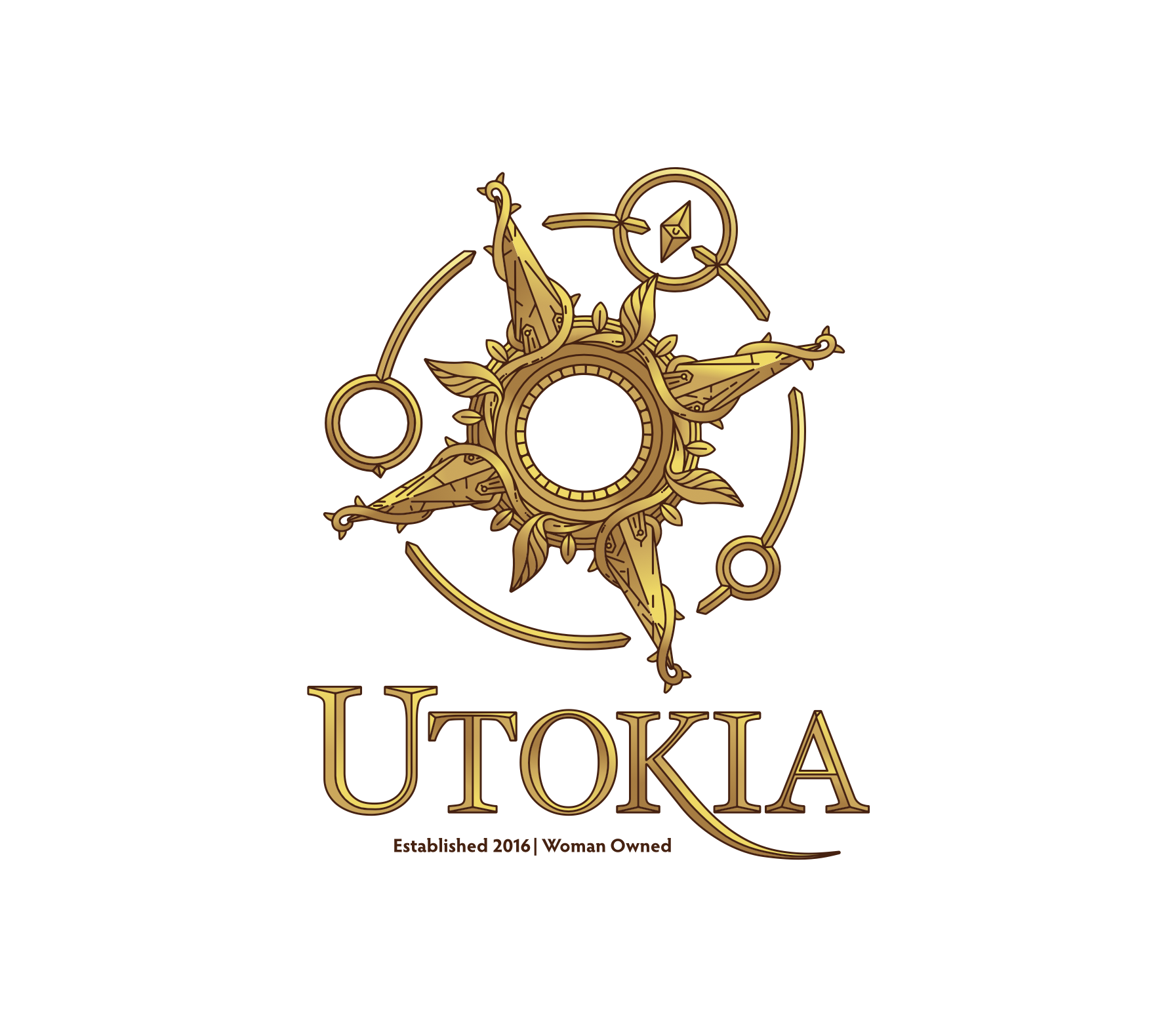
 

This main logo was the first item we tackled, which would set the tone for the rest of the brand. We wanted to capture the sense of exploration and wonder as well as their connection to the natural world. A compass rose wreathed in ivy captured the feeling of another time and another world, full of adventure. This contained elements that would show up throughout branding and packaging materials.


Branded assets we designed is this illustrated map to serve as a backdrop and texture applied to various packages, as well as the layout for their elaborate trading card system. Treated like a traditional fantasy trading card game, each tiered card is matched to a cannabis strain, and is often illustrated as a character or being from the world of Utokia.